Enhancing mobile user experience for higher conversions

Are you reading this on your phone? Chances are, yes - just like your customers. With mobile traffic leading digital engagement, a seamless mobile experience is critical. Yet many businesses still struggle with mobile conversion rate optimization, losing out due to slow load times, poor design, and frustrating checkouts.
If you’re looking to how to increase mobile conversion rate, this guide will walk you through practical UX fixes to help you turn mobile visits into measurable business growth.
Why mobile UX matters more than ever
Mobile devices have become the primary gateway to the internet for many users, making a seamless mobile experience crucial for any business. But despite the prevalence of mobile browse, conversion rates on smartphones often lag behind desktop. In fact, conversion rates tend to be significantly higher on desktop, about 1.7 times higher than on smartphones. This disparity highlights a critical area for improvement for many businesses.
| Sector | Mobile | Desktop | Overall |
| Device usage | 75.0% | 25.0% | N/A |
| Conversion rate | 2.8% | 3.2% | 2.9% |
| Add-to-cart rate | 6.4% | 6.2% | 6.8% |
| Cart abandonment rate | 79.0% | 68.1% | 76.2% |
2024 conversion rate statistics by Dynamic Yield
A poorly designed mobile site can lead to significant consequences, including high bounce rates, user frustration, and even penalties from search engines like Google. Consider this: approximately 57% of internet users say they won’t recommend a business with a poorly designed mobile site. When mobile UX is executed well, however, it presents a substantial opportunity for Conversion Rate Optimization (CRO), turning casual browsers into loyal customers.
If you’re not sure where to start, here’s a helpful guide to mobile-first design.
UX principles that drive mobile conversions
To truly excel in conversion rate optimization UX, it's vital to embrace core user experience for CRO principles. These principles form the bedrock of an effective mobile strategy and can dramatically impact your UX conversion rate.
At the forefront is mobile-first design, which prioritizes the mobile experience from the outset, ensuring responsive layouts that adapt seamlessly to various screen sizes. Simplicity is key; intuitive navigation, clearly visible Calls-to-Action (CTAs), and lightning-fast load times are non-negotiable for keeping users engaged.
Building trust is also paramount, which can be achieved through the prominent display of security badges and positive customer reviews. Did you know that UX-optimized web designs have the potential to increase conversions by up to 400%? This staggering statistic underscores the immense power of a well-crafted user experience.
If you're serious about user experience for CRO, it starts with getting these basics right. Better UX doesn't just feel good, it performs better too.
Practical ways to optimize mobile UX for CRO
If you're wondering how to increase mobile conversion rate, the answer lies in fixing what slows users down or turns them off. Below are practical, high-impact actions you can take to improve UX design to improve website conversions, especially on mobile.
Accelerate mobile page speed
Mobile users expect speed, and if they don’t get it, they bounce. 53% of visitors leave if a mobile page takes longer than three seconds to load (SiteBuilderReport). Even a 0.1-second improvement can lead to an 8.4% increase in conversions and a 9.2% lift in average order value, according to 2024 data from NitroPack & Google.
So how do you fix it?
- Compress images using modern formats like WebP. Tools like TinyPNG or ImageOptim can reduce file sizes without sacrificing quality.
- Enable lazy loading so images and content only load when they come into view - reducing initial load strain.
- Minimize JavaScript and CSS by eliminating unused code and combining files where possible. Use tools like UglifyJS or PurifyCSS.
- Use a content delivery network (CDN) to serve assets from servers closer to the user’s location, speeding up load times worldwide.
- Leverage browser caching to avoid re-downloading resources for repeat visitors.
- Prioritize mobile-first performance in your build process - design for mobile load speed first, not as an afterthought.
Regularly audit your site with tools like Google PageSpeed Insights or Lighthouse to identify what’s slowing you down. Small fixes here can lead to big wins, especially when mobile speed directly affects both user experience and conversions.
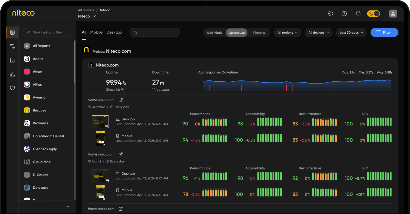
Checking mobile speed and perfomance with Niteco’s Performance Insights
To check your mobile performance and speed more effectively, use Niteco’s Performance Insights. It gives you a detailed view of how your mobile site performs across different devices and regions, tracking real-time load speed, accessibility, SEO, and Core Web Vitals.
Simplify navigation and layout
Mobile users won’t dig around to find what they need. If your navigation is confusing or overloaded, they’ll bounce. Google-backed research shows users are 5 times more likely to leave a mobile site when navigation is difficult to use (Omniconvert).
To keep users engaged, make navigation seamless:
- Use a clean, uncluttered layout that focuses attention on key actions and content.
- Keep menus short and intuitive, grouping related pages under clear categories. Avoid long dropdowns or deep menu trees.
- Add a prominent, always-accessible search bar, ideally at the top of the page. This gives users a fast shortcut to what they want.
- Highlight essential elements, like the cart, account, and product filters, with easy-to-recognize icons or buttons.
- Use sticky headers for quick access to navigation on scroll-heavy pages.
Good navigation isn’t just about usability, it’s about conversion. When shoppers can move through your mobile site easily, they’re more likely to stick around, explore, and buy.
Streamline the mobile checkout process
The checkout is where many mobile journeys fall apart. With cart abandonment on mobile reaching 85.65%, complex forms and forced account creation are major turnoffs for shoppers (Scoop Market).
A smoother checkout can make a big impact. One retailer boosted mobile conversions by 20% simply by switching to a single-page checkout. Another cut cart abandonment by 15% by enabling autofill for forms (Cartboss).
To improve your mobile checkout:
- Keep forms short - only ask for the essentials. Use smart defaults and error handling to reduce frustration.
- Allow guest checkout, so users don’t have to create an account to complete their purchase.
- Enable auto-fill and mobile-friendly inputs like dropdowns or number pads for smoother data entry.
- Offer fast payment options like Apple Pay, Google Pay, or PayPal for one-tap purchases.
- Show progress indicators so users know how close they are to finishing.
- Display trust badges and security icons near payment fields to boost confidence.
When checkout feels fast and effortless, more users will follow through. It’s one of the most direct ways to increase mobile conversions without needing to drive more traffic.
Design for thumb-friendly usability
Most people aren’t scrolling your site with two hands and full focus, they’re multitasking, holding a coffee, or walking to a meeting. In fact, 75% of all phone interactions are driven by thumbs, according to 2024 UX research from Drip.
If your interface isn’t designed with thumbs in mind, you’re making it harder for users to take action.
Here’s how to fix that:
- Place key interactive elements (like CTAs, navigation, and form buttons) within the “thumb zone” - the lower third of the screen where users naturally tap.
- Make tappable targets at least 48 pixels wide and tall to avoid misclicks and user frustration.
- Space buttons far enough apart so users don’t accidentally hit the wrong one.
- Avoid placing key actions in hard-to-reach corners, especially for right-handed users on larger screens.
- Use sticky buttons for important actions like “Add to Cart” or “Next” so they’re always accessible.
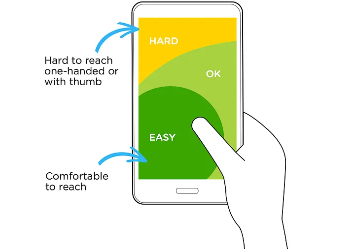
Optimizing mobile UI for one-handed use (image source: medium.com)
Good mobile UX isn’t just about how it looks, it’s about how it feels in the hand. Designing for one-handed, thumb-driven use helps remove friction and keeps users moving smoothly toward conversion.
Enhance calls-to-action (CTAs)
A strong call-to-action is often the difference between a bounce and a conversion. On mobile, where attention spans are shorter and screens are smaller, CTAs need to stand out and stay visible. Research from Scoop Market shows that simply switching to a clear, bold button can increase conversions by 28% to 38%.
To get the most from your mobile CTAs:
- Use action-focused language like “Buy Now,” “Get My Offer,” or “Start Free Trial” that makes the next step clear.
- Place primary CTAs above the fold, so users see them immediately without scrolling.
- Make buttons visually distinct using high contrast and generous white space around them.
- Use sticky CTAs that stay fixed on the screen as users scroll - ideal for product pages or checkout flows.
- Limit distractions around your CTA. Too many buttons or competing links can dilute its impact.
Also, test placement and wording. Even small changes can drive big results when your CTA is clear, visible, and easy to tap. It’s one of the simplest, most effective ways to increase engagement and drive mobile conversions
Minimize intrusive pop-ups
Few things frustrate mobile users more than a pop-up that blocks the screen the moment they land. According to a Google-backed study, 69% of users say annoying pop-up ads lead them to abandon the page entirely (JEMSU). That’s a lot of lost opportunities before the user even gets to your content.
To avoid disrupting the user journey:
- Avoid immediate pop-ups that trigger on page load. Let users engage before asking for anything.
- Use smart triggers, like scroll depth (e.g., 50% down the page) or exit intent, to time your message more naturally.
- Keep messaging short and value-driven, whether it’s a discount, signup offer, or product suggestion.
- Always include a clear, tappable close button, positioned for easy thumb access.
- Test alternatives, like sticky bars or slide-ins, which are less intrusive but still visible.

An example of sticky Add to cart button design
Pop-ups aren’t bad by default, but when they interrupt instead of assist, they kill conversions. Done right, they can support user experience for CRO instead of working against it.
Build trust with security signals
Trust is a big deal, especially on mobile, where users are more cautious about entering personal and payment details. In fact, simply displaying trust badges like SSL certificates or secure checkout icons can boost conversions by up to 42% (Onramp Funds).
Here’s how to build that trust visually:
- Use recognizable security badges (e.g., Norton Secured, McAfee, SSL lock icons) near payment forms.
- Show verified payment options like Visa, MasterCard, PayPal, Apple Pay, and Google Pay to reinforce legitimacy.
- Highlight customer reviews and testimonials close to the action, especially for high-value items or services.
- Include guarantees like “30-day money-back” or “100% secure checkout” near CTAs to reduce hesitation.
- Avoid overly aggressive language or too many pop-ups, which can feel scammy and erode confidence.
These small visual cues can make users feel safer and more confident at the moment of decision. In the mobile experience, where distractions are high and screen space is limited, trust isn’t just helpful, it’s essential for conversion.
Continuously A/B test and analyze behavior
CRO success is an ongoing process, not a one-time fix. Businesses that run regular A/B tests see an average 49% improvement in conversion rates, according to Scoop Market. The most successful teams treat their mobile UX like a living system: constantly learning, testing, and evolving.
To stay ahead:
- Use session recordings (like Hotjar or FullStory) to watch real users interact with your mobile site and spot friction points.
- Deploy heatmaps to see where users click, scroll, or stall, especially helpful for identifying weak CTAs or confusing layouts.
- Run A/B tests on headlines, layouts, buttons, checkout flows, and more to validate ideas with real data.
- Track funnel performance to pinpoint exactly where users drop off, so you can prioritize what to fix next.
- Test one change at a time, so you know what actually caused the lift (or dip) in conversions.
No matter how good your mobile UX is today, user behavior changes fast. Continuous testing helps you stay responsive, reduce guesswork, and make smarter decisions that actually move the needle.
How Niteco helps you deliver mobile-optimized experiences
La Vie en Rose had a challenge many brands face: high mobile traffic but lower conversions compared to desktop. The issue wasn’t demand; it was experience. Our team discovered that desktop users who used the “Quick View” feature on product listing pages converted 2.4 times more than those who didn’t. But mobile users didn’t have access to that same experience.
Therefore, we came up with mobile-specific UX improvement: A new feature allowed shoppers to view product details and add items to their cart directly from the listing page, without extra taps or page loads. The After testing with Optimizely, the results were clear:
- 14% increase in mobile Product Listing Page add-to-cart actions
- A smoother, more intuitive mobile shopping journey
- Significant progress in closing the desktop-mobile conversion gap
This project proves that small, strategic UX changes, when backed by solid data, can drive major growth on mobile.
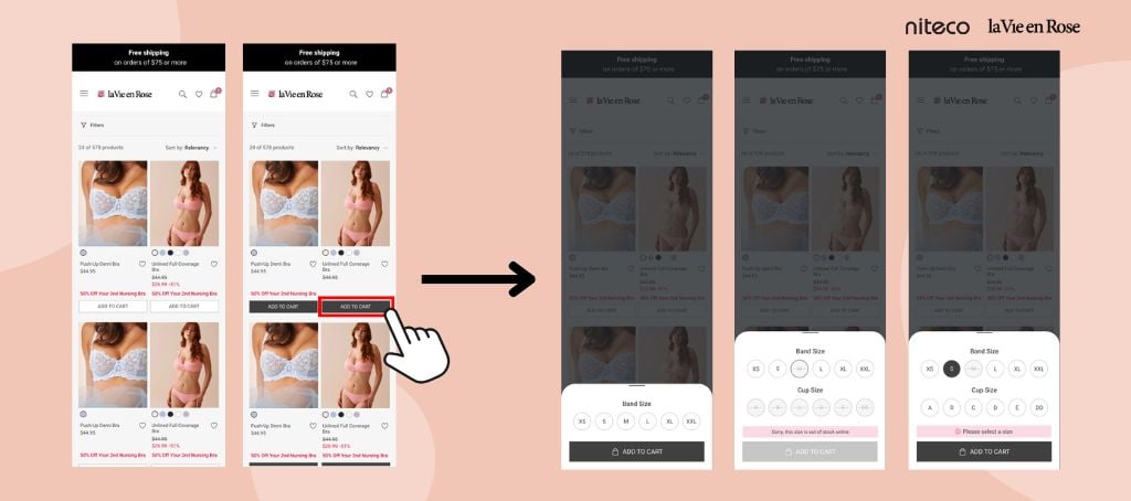
Niteco experts make add-to-cart button on la Vie en Rose's PDP sticky to increase ATC rates
Conclusion: Smarter mobile conversion rate optimization with Niteco
The business case for UX-driven conversion rate optimization UX on mobile is undeniable. By prioritizing a seamless and intuitive mobile experience, you can unlock significant growth in your mobile conversion rate optimization efforts and, ultimately, your bottom line. Don't let a suboptimal mobile experience hinder your business's potential.
Ready to take the next step towards higher mobile conversions?
FAQs
Slow load times, confusing navigation, intrusive pop-ups, and complex checkouts are the biggest drivers of mobile drop-offs.
Run A/B tests monthly and review UX performance quarterly to keep up with changing user behavior and device trends.
High bounce rates, low add-to-cart actions, or checkout drop-offs often signal UX issues that need optimization.


