In our industry, it’s common to put people firmly in two camps - the back-enders and the front-enders.
The back-enders are the data wizards who can distil valuable information out of complex relational graphs of data. Front-enders specialize in putting pixels on screens and design interactions. While there’s value in specialization, working in silos means we may not always see the ‘bigger picture’ and that’s a disservice to our customers. After all, truly great products only happen when barriers are broken down and colleagues collaborate.
Nowhere is this divide more clearly evident than when developers work on charting. Now you may say that charting on the web is a done deal thanks to the hundreds of libraries available, both free and commercial. Yet I would argue that the sheer number of libraries shows that there's an unfulfilled demand among developers for something that's both simple and powerful. The libraries for charting on the web also fall into two camps.
In one camp, we have the top-down, ready-made, battery-included solutions. Some popular members of this category are:
- HighChart
- Google Chart
- Chartist
- ChartJS
To the casual developers, they seem to offer all kinds of visualizations imaginable: line, bar, area, pie, doughnut, scatterplot, polar, tree... And a large part of their appeal is that developers can treat them like a black-box machine where data comes in from one end and a beautiful chart comes out from the other. However, it's not apparent from their shiny demos where you might run into the wall:
- Their documentation, though well-written and comprehensive, can be quite daunting. It can take hours to hunt down the magic incantation for some simple customization options like the direction of a gradient or the location of an axis. And that's just the color, shape and size. Animation and interaction can be even harder to customize. At times, the frustration experienced when attempting to bend the standard chart to a specific design can be comparable to operating the USS Enterprise with a joystick!
- The more complex the visualization is (e.g. tree or node graph), the less customization options you have. And it's understandable, since it's not economically viable for a library provider to support all the edge cases. It's also the reason why libraries that support the most number of chart types often have a commercial license.
- They're hard to modularize or optimize. There are often cases where you only render a line chart, but the visitor has to download the code for a bazillion other kinds (bar, area, spline...)
In the other camp, we have the bottom-up approach that is D3. Originally written in 2011 by Mike Bostock originally for The New York Times, D3 is not a charting library but a toolbox for data visualization. One can find many things in this toolbox:
- DOM query and manipulation, event handling
- Transition, tweening, and interpolation
- Scale for transforming continuous and discrete data
- Select, drag, drop and zoom behavior
- Shape drawing
- Color manipulation
- Layout calculator
- Axes
- Statistical algorithms and data structures
A new version D3v4 came out in mid-2016. This one is completely modularized and support ES6 imports. As such, it lends itself very well to optimizations like tree-shaking and developers can choose to pick only the parts that we need.
However, just by looking at the API, it's not immediately apparent how a developer can create a simple thing like a bar chart with D3.
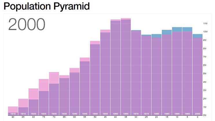
Take for example this simple chart showing the distribution of age groups across the years:

This diagram shows the distribution of age groups in the United States over the last 150 years. Source: bl.ocks.org
This is basically the D3 approach for this case:
- Analyze data that we have
- Identify the measures: population count
- Identify the dimensions: sex and age group (correlate with year of birth)
- Measure canvas we're drawing on (width, height, margin)
- Transform the data into visual elements
- The age group dimension is transformed horizontally onto columns the canvas at the equal width and distance (D3.scaleLinear on the number of groups)
- The sex dimension is transformed into the colors pink and blue
- The population count dimension is transformed into the height of the columns (also D3.scaleLinear, but on the count)
If it seems like a lot of work to you, that's because it is.
Using D3, a developer cannot be ignorant of the proper data structure and transformation. You must also be mindful of how the visual elements appear on the canvas and how the user interacts with them. In short, it requires a bit of both the back-end and front-end skill sets.
Let's take a library in the opposite camp like HighChart for example. With HighChart, we can just dump in the data and be done with it. Tweaking the HighChart output to match, however, is an entirely different story. Compared to HighChart, D3 has a much steeper learning curve. But once learned, we can apply that knowledge in order to create more amazing and complex charts. With D3, there's no upper limit to what we can do and how crazy we can be.

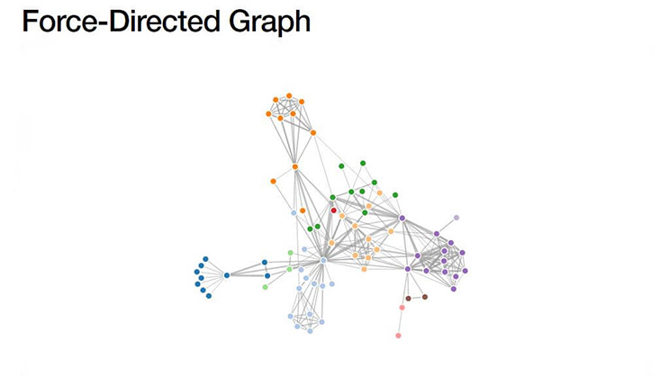
This simple force-directed graph shows character co-occurrence in Les Misérables. Source: bl.ocks.org
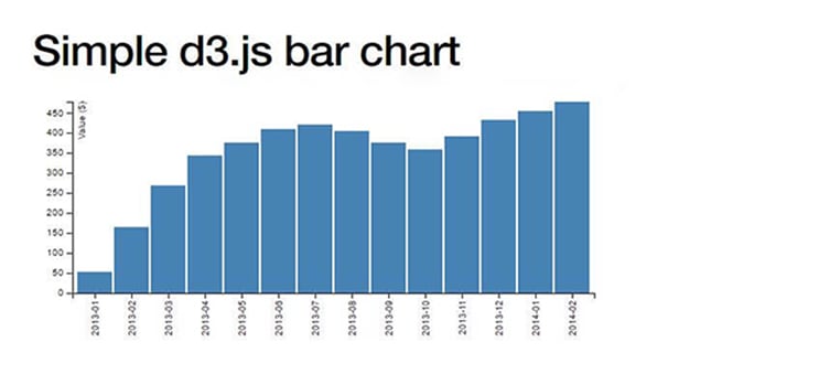
This is a D3.js bar chart as used as an example in the book D3 Tips and Tricks. Source: bl.ocks.org
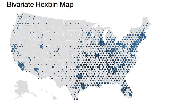
This is a D3 hexbin map showing the locations of 3000 Walmart stores. Source: bl.ocks.org
So the TL;DR version:
Pick a top-down charting solution like HighChart or Google Chart when:
- You don't have much time
- You're reasonably experienced with the library at hand (so as not to get bogged down in documentation and customization)
- You can get the stakeholders and designers to agree on certain compromises between their vision and what is available out of the box
- Most of your charting needs fall inside the few established chart types (i.e. column, line and pie charts with an occasional tree diagram)
Pick D3 if you:
- Know what you're doing well and aren't afraid to get your hands dirty
- Need very complex and specific visualizations
- Want something that stands out and are frustrated with the degree of customization and interaction allowed by other top-down libraries
- Are conscious about download size and you want to keep the number of dependencies to a minimum
- Want to integrate visualization into your existing rendering pipeline (be it HTML, SVG, canvas or React's virtual dom)
Whichever path you take, it's important to remember that data wrangling and pixel pushing are equally important.
Found this blog post useful? Niteco’s Front End team is endlessly innovating. Find out what solutions they can create for you today.
to transform your business and drive results?


