Effectively utilizing data is crucial for staying ahead of the competition in digital marketing. To do this, you need a data dashboard that can consolidate multiple data sources and offer a comprehensive snapshot of key metrics and performance indicators.
However, many marketers struggle with building a data dashboard that truly meets their needs due to various reasons, from uncertainty about where to start to confusion over which data tools to use.
In this guide, we'll show you how to create a data dashboard that facilitates your data analysis process, helping to turn raw data into actionable insights that drive strategic decision-making and fuel business growth.

Benefits of a data dashboard in digital marketing
1. Enhanced data-driven decision-making
Data dashboards facilitate informed decision-making in digital marketing by providing insights derived from relevant information. With clear breakdowns of key metrics such as organic traffic, conversion rates, and user behavior, the data gives insights to empower marketers to monitor their marketing efforts effectively. Meanwhile, tracking marketing ROI with dashboards can help marketers allocate resources more efficiently and optimize campaigns for maximum impact.
2. Improved efficiency and time-saving
Centralizing data in one place obviously streamlines workflows and saves valuable time. With everything accessible from a data dashboard, marketers can quickly analyze data, identify trends, and make informed decisions without the need to switch between multiple tools or sources.
3. Enhanced communication and collaboration
Dashboard visualization tools play a crucial role in improving communication and collaboration within a company. By presenting data in a visually appealing and easy-to-understand format, dashboards facilitate clearer communication of insights and foster collaboration among team members for more effective marketing campaigns.
What are the best tools to build a data dashboard?
When it comes to selecting data visualization tools for digital marketing and building a marketing analytics dashboard for small businesses, here are some of the tools we recommend:
- Microsoft Excel (Free): A familiar and accessible option for creating basic dashboards. While offering limited customization, Excel integrates well with other Microsoft products, making it suitable for small businesses looking to get started with data visualization, and the online browser-based version is completely free.
- Google Data Studio (Free): With its intuitive drag-and-drop interface and pre-built connectors to Google products, Google Data Studio is an excellent choice for beginners and non-technical users. It enables small businesses to create visually appealing dashboards without the need for advanced technical know-how.

- Tableau (Paid): Tableau offers powerful data manipulation capabilities and advanced visualizations. While it may require some technical expertise to fully leverage its features, Tableau is well-suited for small businesses looking to create sophisticated dashboards and analyze complex datasets.
- Power BI (Paid): Developed by Microsoft, Power BI seamlessly integrates with Excel and offers robust business intelligence capabilities. Its interactive features allow for the creation of dynamic dashboards and reports, making it an ideal choice for small businesses seeking actionable insights from their data.
How to create your data dashboard: The ultimate guide

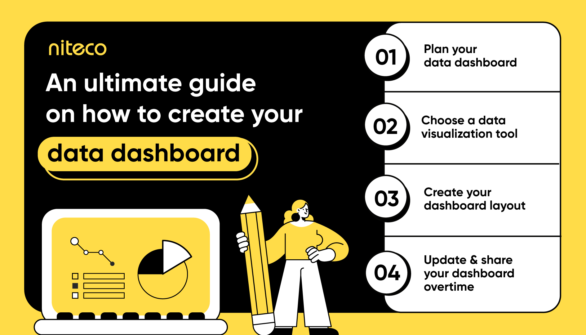
1. Planning your data dashboard
Before diving into creating your effective data dashboard, you will need to plan things out clearly. Let’s start with the "why" and "how" questions first. Why do you need a data dashboard? Because you need insights about KPIs or even business performance. How can you get the insights you want? You need to identify the objectives, purpose, and the people going to use the dashboard for the analysis process.
In fact, who will be using the dashboard is one of the defining questions that need to be answered before going any further. For instance, marketers may require a dashboard that can provide insights into digital marketing KPIs, such as website traffic, conversion rates, and social media engagement metrics. Other stakeholders, like technical teams or business decision-makers, might require other data and different visualizations, depending on their data literacy.
2. Choosing a data visualization tool
Since the data you need might come from multiple sources, you cannot just check it all at once. Next, you will need to answer what tool can help you with that. As we shared above, you can either choose a free or paid tool, depending on your business requirements and needs. The priority for choosing your tool should be a high level of clarity and user-friendliness. Another important factor for the tool should be its capabilities. But don’t be too greedy going for tools with lots of fancy features. This can make things messy and harder to use. Instead, focus on what your business needs, and remember that you can always add more features later if you really need them.
Learn more about how Niteco delivered a customized live dashboard to the AEG team using Google Data Studio.
3. Creating your dashboard layout
The layout of your dashboard can be a crucial part of the whole project – by choosing which data is positioned prominently, you will inevitably guide those users with lower data literacy to pay more attention to it. In combination with the visualizations you choose, it sets the tone for which insights these users might be able to get from your data down the road.
Data visualizations are mostly used to convey information to people who don’t want to dive into the process’s details and numbers, then help them transform insights into actionable steps. The next question will be: How can you present the data you have in easily accessible and understandable visualizations that cater to various divisions within the business. There are several common types of graphs and charts that can effectively illustrate different data insights:
- Pie charts: Circular visualization representing parts of a whole, suitable for displaying relative sizes of categories (2-7) rather than exact numbers.
- Bar charts: Effective for comparing quantities across multiple categories and showing differences clearly.
- Line charts: Ideal for illustrating trends over time.
- Besides, there are other visualization types such as scatter plots, area charts, heatmaps, and simple tables.
4. Adding interactivity (Optional)
To further enhance user experience and engagement, you can consider incorporating interactive features like filters and drop-downs to allow users to explore data more deeply and easily navigate to the data they need.
5. Updating and sharing your dashboard over time
Once your dashboard is complete, it's crucial to update and share it with your teams. Why update? Because you'll need accurate data for up-to-date insights and informed decision-making. Plus, if your objectives change, updating the dashboard is essential.
Why share it with your teams? Firstly, they can point out any missing data or suggest improvements for better communication. Additionally, sharing the dashboard among teams fosters transparency and collaboration, ensuring everyone is on the same page and aligned with organizational goals. This collective input can lead to a more comprehensive and effective dashboard that meets the needs of all stakeholders.
Bonus tips for designing an effective marketing performance dashboard
Designing a marketing performance dashboard that truly delivers requires careful consideration and adherence to marketing dashboard best practices. Here are some bonus tips to ensure your dashboard works effectively:
Storytelling with data
Don't just present data; tell a compelling story with it. Use visuals and insights to narrate trends, identify areas for improvement, and showcase marketing campaign successes. This approach engages stakeholders and drives meaningful discussions around performance metrics.
Only include what's important
Don’t try to overcrowd your dashboard with unnecessary metrics. Focus on key metrics that directly contribute to your marketing objectives, ensuring your dashboard remains concise and actionable.
Group your related metrics
Organize related metrics into logical groups to improve navigation and streamline data interpretation. You can group metrics by campaign, channel, or audience segment to give better context and facilitate deeper insights into marketing performance.
Be consistent
Maintain consistency in design elements, such as layout, fonts, and colors across your dashboard. Consistency not only enhances visual appeal but also makes it easier for your users to familiarize themselves with the dashboard.
Accessibility is key
Ensure your dashboard is accessible across various devices, including desktop and mobile, to facilitate on-the-go data checks for busy marketers.
Conclusion
Creating a data dashboard is a multifaceted process crucial for informed decision-making in digital marketing. Throughout this guide, we've outlined key steps to assist you in building an effective dashboard, from defining your goals and selecting the right data sources to designing the layout and adding interactivity. By following these steps, you can create a dashboard that empowers your marketing efforts and drives business success. Niteco can further facilitate the data dashboard building process with our experienced experts. Contact us now for assistance!
to transform your business and drive results?


