The success of a marketing campaign often hinges on the quality of the landing page to which your users are directed. Niteco gives you the basics on building an effective Commerce landing page.
Commerce can be a tricky business. When you build and maintain an Commerce site, success or failure depends on a plethora of details that can influence the behavior of your (potential) customers. Apart from obvious considerations like whether your products and prices are attractive enough or whether your site performs well in terms of speed and user experience, there are other variables you can work on to increase your chances of converting a user.
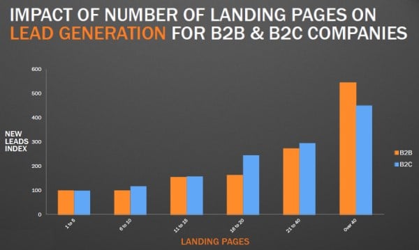
An incredibly powerful tool to increase Commerce conversion is creating landing pages for your campaigns. Unlike product pages, landing pages are focused on the sole goal of converting its visitors, which are usually sent there as part of a marketing campaign. They offer the most attractive information you have while leaving out any distractions that may take a user away from the page. And they’re a great way to increase your marketing ROI. Hubspot estimates that companies that increase the number of their landing pages from 10 to 15 see a 55% increase in leads.

Diagram: Hubspot
Read on to find out more about the Best Practices we here at Niteco follow in order to create landing pages that convert.
Customize for your target audience
For the sake of this article, let’s assume that your business sells a wide array of coffee makers, from simple moka pots through automatic espresso machines all the way to restaurant-grade appliances. Currently, you’re trying to sell a line of automatic cappuccino machines that use a capsule system – not top of the line, but still quite pricy.
Your ad campaign is focused on professionals over 30, and all your ads lead to this landing page you’re going to build.
Since your ad campaign is personalized for the target audience, of course your landing page should be as well. Copy and imagery should be appealing to the people to whom you’re trying to sell, in this case focusing on ease and convenience, while at the same time emphasizing high quality and great taste.
If you’re selling moka pots targeted at a younger, cosmopolitan, possibly college audience, you might instead want to focus your copy on affordability and coolness.
Use a single CTA
The golden rule of landing pages is to keep distractions to a minimum. That also means that you shouldn’t include more than a single CTA. That CTA could be “Buy now” or “Get your discount code now” or anything else your campaign is focused on (for more on Commerce CTAs, check out BigCommerce). The point is that getting visitors to click that CTA is the sole focus of the page.
Now, this doesn’t mean that there should only be one button on that page. In fact, it can be better to include the same CTA multiple times, as long as you make clear that they will accomplish the same goal. For instance, it’s a great idea to include a CTA above the fold, allowing visitors to see the most relevant information about your products and the button they’re supposed to click at first glance. If you have further information below the fold, it’s best to include the same button below or in tandem with that information as well. You don’t want users to have to go searching for the CTA button.
Perform A/B Testing
Landing pages are great for A/B testing, since it’s easy to see exactly how user behavior changes with your variant versions. Test different CTA wording, different images, different copy or just different content altogether.
Just remember to make only one change per version to ensure that you know exactly why users behaved differently. If, for example, you test against a version that has different CTA copy AND different images, there’s no way for you to know for sure what caused the different behavior.
Use high-quality images
Now more than ever, online users respond more strongly to visuals than to text. According to Hubspot, 90% of information transmitted to the brain is visual, and visuals are processed 60,000X faster in the brain than text. Add to that the fact that high-quality images will give your product presentation a more premium feel, and you have all the reasons you need to splurge on your photography budget.
Avoid distractions
As mentioned above, the be-all and end-all of a good landing page is keeping it focused on the single goal of conversion, leaving out any distractions. That also means that your landing page should appear completely independent of the rest of your site. Leave out the usual site navigation, don’t link to several individual product pages, and don’t add information that isn’t directly connected to what you’re presenting.
What your landing page should contain is:
- Great imagery
- Clear information on the benefits your products bring
- Clear information on the offer you’re presenting
- Social proof
- A single CTA
No more, no less.
For more information on how Niteco builds and maintains Commerce sites, take a look at our Electrolux Vietnam case study. To find out more about our Commerce services, click here.
to transform your business and drive results?
