Why your website conversion rate is so low and how to improve it

Your website might be getting plenty of traffic, but if visitors aren't taking action, you’ve got a low conversion rate problem. A low conversion rate means people are landing on your site but not completing the actions you want like making a purchase, signing up, or clicking a CTA.
So, why is your website not converting? There’s no single answer. The problem could be poor UX, slow load speeds, unclear CTAs, or even a misaligned audience. This guide breaks down what causes low conversion rates and shows you how to fix them with real strategies.

How to know if your website isn’t converting
Review and compare your conversion rate with the industry benchmark
The first step in tackling website not converting is to track and benchmark your current conversion rate. Conversion rate standards vary across industries, so knowing what’s “good” in your field matters. In Commerce, average conversion rates typically fall between 2% and 4%, depending on product type and audience. According to ConvertCart, top performers often exceed 4%, with some even hitting 6% or higher.
If you need a primer on doing this, read our guide on how to track and calculate website conversion rates to ensure you’re measuring accurately.
A high bounce rate means your site isn't converting
The bounce rate is simply the percentage of visitors who quickly leave your site after viewing just one page. If that number is consistently climbing past 70%, it's a huge warning sign: your website isn't working hard enough to convert visitors. High bounce rates usually mean your content doesn't match what the user was looking for (their intent), your page loads painfully slowly, or the layout is confusing, making it hard to figure out the next step.
When users arrive and immediately hit the back button, they aren't clicking, exploring, or taking any action. That immediate lack of engagement directly impacts your conversion rate and signals that your site isn't giving people a compelling reason to stay.
A short average session duration means visitors aren't engaging with your site
Average session duration tracks how long people actually spend on your site before they bail. When this number dips below 1 minute, it means visitors are essentially landing, scanning, and exiting (Databox, 2025). They're not taking the time to read your valuable content or interact with your pages.
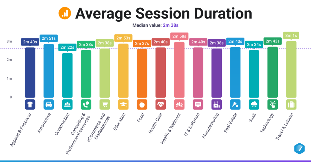
The average session duration across different industries (source: Databox)
Short sessions often point to weak messaging, an unclear value proposition, or content that simply fails to deliver the answers or solution the user came for. If people aren't spending enough time to learn about your offer, compare their options, or truly evaluate your solution, they won't convert. Conversely, longer sessions usually equal deeper engagement and a much better chance of moving them smoothly toward the next step in your funnel.
Why is your website conversion rate so low?
These two metrics: high bounce rate and short session duration, are just symptoms of a deeper problem. There are lots of things that can hurt your conversion rate. Here are the most common reasons that cause real trouble on most websites.
Poor user experience (UX) causes low conversion rate
A poor user experience is one of the fastest ways to lose visitors. If your website frustrates or confuses users, they won’t stick around, much less convert. Some of the most common UX problems include:
- Cluttered or confusing website design: Visitors struggle to navigate and find what they need.
- Slow loading times: Frustrated users are likely to abandon your site.
- Broken links or elements: Non-functioning buttons, links, or forms create a negative experience.
- Lack of mobile responsiveness: A website that doesn’t adapt to different devices frustrates mobile users and kills conversions.
Want to learn how better UX can boost your site’s performance? Check out the benefits of good UI/UX design and how to implement a mobile-first design.
Your site has unclear messaging and weak call-to-action (CTA)
Visitors need to immediately understand what your business offers and what they should do next. If your message is vague or your CTAs is hidden or uninspiring, people won’t take action. Websites too often rely on generic CTAs like “Submit” or “Click Here”. These don’t give users a reason to act. Your CTAs should be benefit-driven and easy to find. Language matters - make it sound natural, direct, and relevant to your audience’s needs. Clear messaging combined with strong CTAs ensures that users know what they’re getting and how to get it.
You are targeting wrong audience
You might be getting traffic, but are they the right people? If your messaging, product, or offer doesn’t speak to your target audience, they’re not going to convert. Good content aimed at the wrong crowd is still wasted. Make sure your marketing attracts the people who will actually buy.
Lack of trust signals may lead to low conversion rate
Trust is a key factor in whether visitors choose to convert. If your site doesn’t show clear evidence that others have had a good experience like reviews or testimonials, people are less likely to take the next step. In fact, 95% of people read reviews before buying (Globe Newswire), so if your product pages lack relevant, specific testimonials, you’re likely losing sales.
It’s the same with security. Shoppers want to feel safe when entering personal or payment information. Displaying trust badges early in the journey, not just at checkout, helps build confidence and encourages users to stay and engage with your site.
Your site has complicated checkout process
Lengthy forms and too many steps are one of the biggest causes of cart abandonment. When users face repetitive fields, no autofill, or unclear errors, the process feels frustrating. Even small delays or confusion can lead to drop-offs. This problem gets worse on mobile, where long forms are harder to navigate. To avoid this, keep the process short and simple. Use autofill, show progress clearly, and only ask for essential details. A smooth checkout experience makes it easier for customers to finish their purchase.
How to improve your website conversion rate
Improving a low conversion rate takes more than quick fixes. It demands a data-driven strategy shaped by real-world experience. At Niteco, we’ve run thousands of successful Conversion Rate Optimization (CRO) experiments, helping businesses turn traffic into results. Below, we’ll walk through key methods that drive higher conversions.
For a deeper look, explore our CRO hacking eBook Ultimate Tips to Skyrocket Conversion Rate. It’s filled with expert insights and proven tactics you can start using right away.
If you want to improve your website’s conversion rate, start by analyzing your conversion funnel. Look at each stage of the buying journey - awareness, consideration, and decision - to identify where users drop off. That insight tells you where to focus your efforts. From there, the tactics below help you optimize each touchpoint to move users forward with less friction and more clarity.
Optimizing landing pages for better UX and UI
Landing pages are where decisions are made. If the page isn’t clear or focused, users leave. A strong landing page has one goal and everything on the page supports that action. The headline should immediately show value, and the content should speak to the user’s needs. Design should guide attention, not compete for it. Use whitespace, clean layout, and a standout CTA. Add trust elements like testimonials or guarantees to reduce hesitation.
Mobile experience matters just as much. A slow-loading, poorly formatted page on mobile can undo all your effort. Make sure the experience is smooth across all devices. If you get the message, design, and user intent aligned, conversions follow. For more tips, see best practices for Commerce landing pages.
Your landing page is where decisions happen. If it’s slow, cluttered, or hard to use, people leave. To keep visitors around and get them to act, you need a page that’s clean, fast, and easy to navigate. Design and content should work together to guide users toward a single goal.
Here’s what actually makes a difference:
- Improve site speed: Faster load times can significantly reduce drop-offs, especially on mobile.
- Simplify navigation: Make it easy for visitors to find exactly what they need without getting lost or frustrated. On landing pages, often this means reducing navigation options to keep the user focused.
- Prioritize mobile-first design: With the majority of traffic now coming from smaller devices, ensuring a seamless, fast, and responsive experience on mobile is non-negotiable.
- Streamline checkout: Reduce the number of steps required, minimize mandatory form fields, and always offer quick guest checkout options to eliminate friction.
- Enhance visual appeal: Use high-quality product images and videos. Utilize whitespace and a strong visual hierarchy to naturally guide the user's eye toward the key conversion element (the CTA).
And if you’ve optimized everything and your site’s still dragging, your platform might be the problem. A slow, outdated backend can hold you back, no matter how good your design is. In that case, consider a better platform migration and replatforming service to improve performance where it really counts.
Explore our platform migration and replatforming services
Conduct A/B testing strategies
A/B testing is the best way to learn what actually works on your site. Instead of guessing, you compare two versions of a page or element, like a headline or button, and see which performs better. The key is to test one thing at a time and base changes on a clear hypothesis. That way, you know what caused the results. When done right, A/B testing gives you insights that analytics alone can’t. Also, don’t forget to test for different devices and screen sizes. What works on desktop may flop on mobile.
A structured A/B testing process is essential if you want consistent, reliable results. Without a clear framework, it's easy to waste time on experiments that lead nowhere. By following a proven process, you ensure every test moves you closer to meaningful, data-driven improvements.
For a full, step-by-step guide to running smarter and more effective A/B tests - from building strong hypotheses to prioritizing what to test - read our complete article on A/B testing best practices. You'll learn how to plan better experiments, avoid common mistakes, and maximize the impact of every test you run.
Using analytics and feedback
To improve conversions, you need to understand both what users do and why they do it. Analytics tools like Google Analytics tell you where users come from, what pages they visit, and where they drop off. But that’s only part of the picture.
Use feedback tools like heatmaps, surveys, and session recordings to reveal user thoughts and frustrations. They show you what users pay attention to, what confuses them, and what stops them from converting. Together, analytics and feedback help identify weak spots and missed opportunities on your site.
Using both allows you to make smart, targeted changes based on real behavior, not assumptions. That’s what turns small tweaks into meaningful results.
Build trust and credibility
Face it: if people don't trust you, they won't buy from you. Building credibility removes hesitation and helps visitors feel more confident about taking action. Here’s how to do it right:
- Incorporate social proof: Add customer reviews, testimonials, and star ratings where they matter most: on product pages, landing pages, and even your homepage. Real voices build real trust.
- Display trust signals: Use recognizable security badges, money-back guarantees, and trust marks early in the journey, not just at checkout. A clear return policy also goes a long way.
- Provide clear information: Make your product descriptions specific and useful. Avoid vague marketing language. And be clear about what makes your offer different or better. When people know exactly what they’re getting, they’re more likely to buy.
Drive action with compelling content
Once people trust you, your content needs to move them. That means clear direction, relevant offers, and no wasted space. Every word, image, and button should push the visitor closer to taking action.
- Craft clear CTAs: Your buttons should stand out and tell people exactly what to do. “Add to Cart,” “Get My Quote,” or “Start Free Trial” works better than vague stuff like “Submit” or “Click Here.”
- Create urgency and scarcity: Give visitors a reason to act now. Limited-time offers, “only 3 left” tags, or showing when a sale ends can make all the difference.
- Personalize the experience: Use what you know about your visitors to show them content that fits. Highlight products they’ve viewed, tailor offers based on behavior, and make the experience feel built just for them.
Conclusion
A low conversion rate is more than a performance issue. It signals that your website experience isn’t fully meeting user expectations. Fortunately, it’s something you can improve with the right focus and strategy.
For real-world examples, see how Niteco helped Electrolux boost website conversions. If you're ready to improve your own website’s performance, explore our Conversion Rate Optimization services and find out how we can help you turn more visitors into customers.
FAQs about why your site doesn’t convert
A low conversion rate means that only a small percentage of your website visitors are completing a desired action, such as making a purchase or filling out a form. It depends on your industry, but typically under 2% is considered low. The key is to benchmark against peers.
An increase in traffic doesn’t always mean better results. If the new visitors are not part of your target audience, they’re less likely to convert. A spike in low-quality traffic from poorly matched ads, irrelevant content, or generic campaigns can cause your conversion rate to drop even while visits rise.
A 1% conversion rate is below average for most industries, especially in Commerce and lead generation. However, what counts as "bad" depends on your industry, business model, traffic source, and goals.
Common issues in retail include slow-loading pages, poor product descriptions, lack of reviews, unclear return policies, limited payment options, and complex checkout processes. All of these can create friction that prevents shoppers from completing their purchase.


