What is mobile first design and how do you implement it?

A mobile first approach refers to the practice of having designers start design work for mobile devices first. The goal of taking a mobile first approach is to reverse what has been the established workflow, namely designing for desktop and scaling down the design for mobile afterwards.
With the number of mobile device users growing around the world, a trend that is unlikely to change anytime soon, creating engaging experiences on mobile devices has become crucial for the success of any online solution. In this post, we will give you the answers to the three most important questions around mobile first: what is mobile-first design, why is it important, and how do you implement it effectively?
What is mobile first design and why is it important?
What is mobile first design?
Mobile first design means that designers working on a new digital experience focus their work on smaller, mobile screens first before later adapting the design for desktop computers and other larger screens.
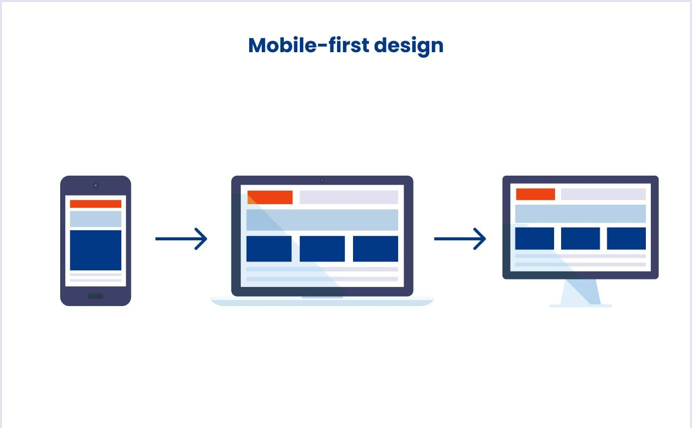
Image source: Codica
Designing for mobile first naturally leads to better decisions about hierarchy, performance, and usability. It’s based on the principle of progressive enhancement: you start with the most critical functionality, then enhance the experience for larger devices where there’s more room to work with. This avoids the pitfalls of graceful degradation, where features are stripped away later, sometimes at the cost of user experience.
To ensure your mobile-first design is effective, keep the following best practices in mind:
- Essential content and functionality first: Mobile first design starts by identifying and prioritizing the key elements users need, keeping distractions to a minimum.
- Touch-friendly interactions: Buttons, menus, and other controls are sized and spaced for easy use on small screens with fingers rather than cursors.
- Clear, concise content: Text is kept short and easy to scan, helping users get information quickly without unnecessary scrolling.
- Optimized performance: Mobile experiences are built to load fast and run smoothly, even on slower networks or older devices.
Why is it important to design for mobile first?
Mobile first design compels teams to prioritize clarity, speed, and usability - especially on the devices people use most. As of 2025, over 63% of global website traffic originates from mobile devices, and approximately 96.3% of internet users access the internet via mobile phones (Explodingtopics.com).
This shift isn't just about user behavior; it's also about search engine optimization. Google's mobile-first indexing means the mobile version of your site is the primary basis for how it's ranked and indexed. If your mobile experience is lacking, your visibility in search results can suffer, even for desktop users.
Moreover, mobile-first design enhances user experience by focusing on essential content and functionality, leading to faster load times and more intuitive navigation. This streamlined approach not only meets user expectations but also contributes to higher engagement and conversion rates.
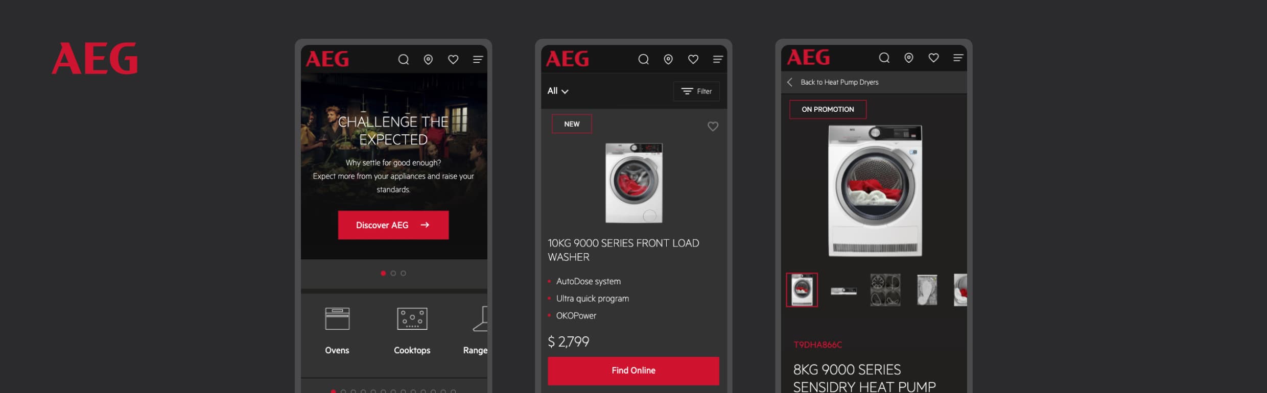
A practical example of this approach is our work with AEG Australia. By starting with mobile in mind, Niteco delivered a streamlined Commerce experience that led to a 12% drop in mobile bounce rate and a boost in both session duration and organic traffic post-launch.
How do you implement a mobile first approach?
Put the user at the center of your design
In the UI/UX design process, nothing has higher priority than the users for whom you are designing. They are the people who will be using your product, so it’s crucial to keep their requirements in mind.
Starting out on a new design process, the most important question you should be asking yourself is, “What do the users expect from this product?”
Take the Tolka project with translation and interpretation agency Transvoice as an example, where Niteco built a completely new user portal with mobile first in mind. To understand the customer’s needs, Niteco’s UI/UX designers held workshops to determine the main pain points of working with the existing platform. The team conducted extensive research on the business field and competitors’ solutions, created user personas to further clarify the needs that needed to be addressed and, finally, presented the customer with wireframes and user flows. This helped them design a product that established a clear workflow for user tasks without distracting secondary functionality.
See how our design process works
Step-by-step guide to implementing a mobile first design
1. Get organized
What is the first step in the mobile first design process? A major part of building a mobile first design is setting the scope and prioritization of the mobile application. In your first design meetings, you will likely come up with or receive requests for a long list of features that should be included in your application or website. Banners, videos, menus, account management, blogs, and more. The next step, however, is to figure out which is the key functionality – the reason your users use your application. And this is where a spreadsheet is your best friend.
List out all the content you have and wish to include in your design, then create a hierarchy that will help guide you in prioritizing and placing the most important features.
2. Prioritize your features
For a very simplified example, let’s assume that your application’s purpose is to book tables in restaurants. Your application will need to have lots of features to cover everything you may envision – account management, favorite lists, promotions, etc. However, the main features would likely be the following:
- Choosing restaurants
- Booking tables
While the other features will still be part of the application, the focus will be on these two functionalities. That means that they will take up most of the used screen space, with controls that are large and comfortable to handle even on the go. In essence, users should still have the option to use other functionality but should not be distracted or have their experience impaired by it. This way, you can ensure that using these features works smoothly on mobile devices. When you upscale the application for larger screens later, you still have the option of giving other features more prominent placement as well.
With the added space, you can add blogs, introduce new restaurants or present bios of new chefs, all while keeping the key functionality of choosing and booking intact.
3. Design the mobile wireframe first
Based on what you decided in the prior step, you can now create your mobile wireframes. Decide exactly which features should be placed where, where CTAs should go, and how users will navigate through your application.
When your mobile wireframe is done, you can use it as a foundation for larger breakpoints in the design of the experience on larger screens. Essentially, in designing the mobile experience, you have pinpointed what the focus of your application should be, and you can use this information for creating a great desktop experience.
Once your wireframes are in place, it’s just as important to ensure your backend can support them. Explore 5 principles to follow when designing the architecture of your application.
4. Get rid of unnecessary obstacles
Some design features work perfectly on large screens, but are nothing more than a distraction or, at worst, an impediment in mobile design.
- Popups: Popups can be annoying on any screen if they’re not used in moderation, but on mobile screens, they can quickly become a deal breaker. Because of the different sizes of mobile devices, if you’re not careful with sizing, a popup can easily hijack a user’s whole screen, keeping them from what they wanted to do in the first place. If you absolutely need to use popups, use them sparingly and only to provide users with information or functionality they absolutely need.
- Images: Website banners are great, but refrain from using large landscape-format images, since they won’t look good on a mobile screen held in portrait mode. Even when you use portrait-format banners, don’t take up an entire screen with images – always ensure that users can see the CTA or key functionality at first glance, without having to scroll.
5. Use responsive design
One thing you need to remember about the world of mobile devices is that one size does not fit all. Smartphones and tablets come in a wide variety of screen sizes, so you need to make sure that your design looks good on all of them. Using a responsive framework allows your design to adjust to the screen on which it is displayed, making sure all essential information is retained. This means that you can focus on the important aspects of your design instead of having to adjust everything manually for every conceivable screen size.
6. Test on real devices
While you’re likely designing your application on a desktop or laptop computer, you should test it on an actual mobile device. Many design programs offer features that let you emulate a mobile screen on your computer screen for testing purposes, but we recommend using a real mobile screen.
Navigate through the entire application like a normal user would, and ideally involve other designers that were not part of the design process. They will be able to look at the application without preconceptions while being able to give you a professional opinion. However, make sure to also involve non-designers in the tests for an additional perspective.
How to test a mobile first design
1. Use testing tools
While, as mentioned above, we recommend testing on actual mobile devices, there are also a number of useful tools that can help you to test the performance and functionality of your application.
Some tools we recommend for use in testing mobile designs are Calabash, Testdroid, Appium, or MonkeyTalk. For cross-browser testing that ensures your application works on any combination of OS, browser, and resolution, a tool like LambdaTest is recommended.
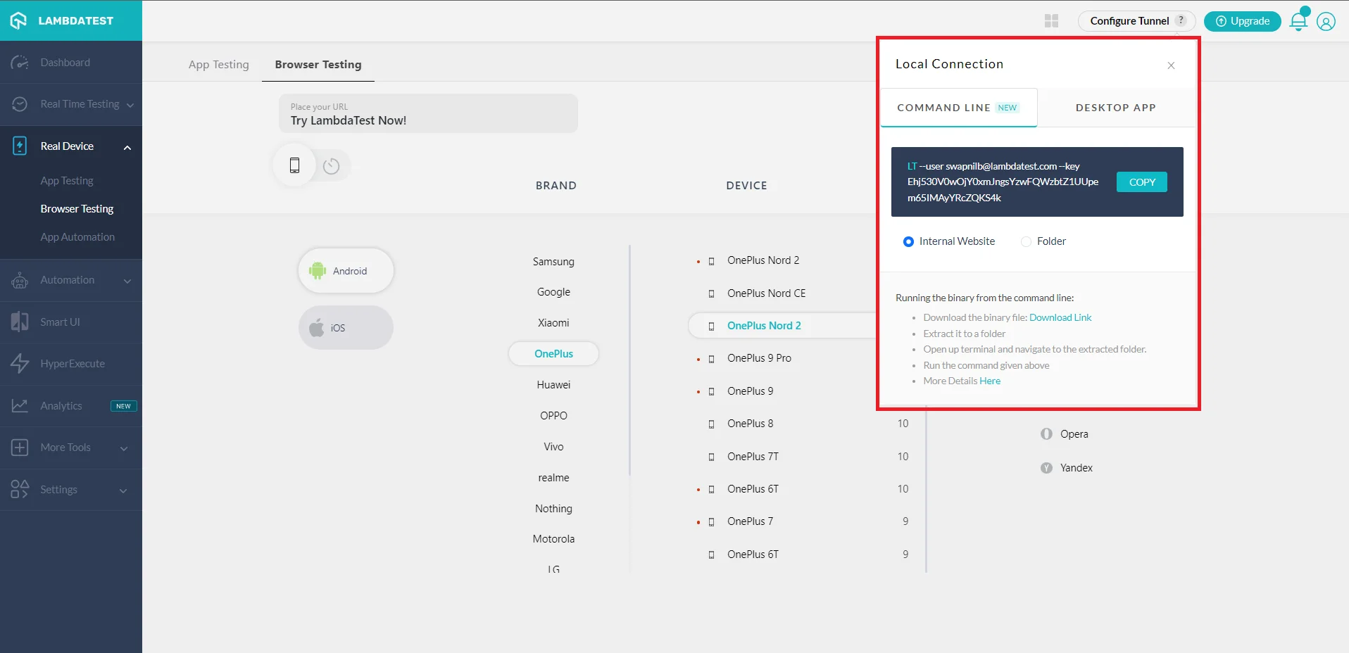
Image source: LambdaTest
2. Validate HTML and CSS
To make sure that any errors in how the application is displayed or how it performs aren’t rooted in your own code, it’s a good idea to use a validation tool to validate the HTML and CSS code. These tools can help you fix syntax errors and other mistakes.
Tool for this testing step is the W3C CSS Validation Service.
3. Perform A/B Testing
Once your application has gone live, it’s time to embark on a thorough A/B Testing campaign. Even after testing, a lot of the things upon which you have based your design are assumptions of what users may like or demand. Now, once actual users get their hands on the application, it’s time to find out what they actually want.
The A/B Testing process is simple: analyze your application’s data, come up with a hypothesis of what could improve your numbers, then test and evaluate. You can use basic analytics to determine where improvements could be made. Heat maps can also be very useful as foundations for your experimentation.
Don’t forget that A/B Testing is an ongoing process throughout an application’s lifecycle. User preferences may change with time and new hypotheses will arise, so don’t neglect your testing down the road.
Some tips for your mobile first design
Mobile first is content first: Determine which content is the most essential for your mobile experience and focus on it. Then create your design based on the content you need to present to the user.
Keep it simple: Simplicity is your friend when it comes to mobile first design. As mentioned above, the goal is to make the key functionality the centerpiece of your design and try to keep distractions to a minimum.
Keep CTAs bold and consistent: Users should be able to locate and recognize your CTAs with ease even if they’re just glancing at their screen while on the go.
Optimize loading speed: Performance is crucial when it comes to user experience. According to Neil Patel’s blog, 47% of users expect a page to load in 2 seconds or less, so make sure to optimize your application’s performance. If your website feels slow and you're losing users because of it, this guide will show you how to speed things up.
If you want to find out more about Mobile First design or need advice on how to create a UI/UX design that converts for your application, contact Niteco today!
Frequently asked questions about mobile-first design
A mobile-first strategy refers to the approach of prioritizing mobile users when shaping your business’ web presence, specifically giving precedence to your business's mobile app and mobile web capabilities over desktop.
As new devices and various screen dimensions come into play, adopting a mobile-first design simplifies adjustment to these shifts. This approach establishes a more resilient design strategy for the future. Additionally, opting for a responsive mobile-first design that takes mobile as its starting point can be advantageous in terms of graceful degradation and progressive enhancement.
In the mobile-first design workflow, you initiate your design process by focusing primarily on mobile users and subsequently expand your design to accommodate larger screens. This approach involves prioritizing the mobile user experience, ensuring that all content and functionalities remain accessible on smaller screens.


